Color Theory Basics and Interior Design
Creating your perfect living space is easier than you think, although there is one special ingredient that can help you tremendously on your journey. Color theory, and the basic ideas of color harmony, will help you transform each room into a space where you instantly feel comfortable, creative, or even energized depending on the palette you choose. Whether you want to repaint all your walls or simply add some perfectly coordinated decor, this guide will cover everything you need to know about color theory so you can confidently express yourself through interior design today!
The Basics of Color Theory
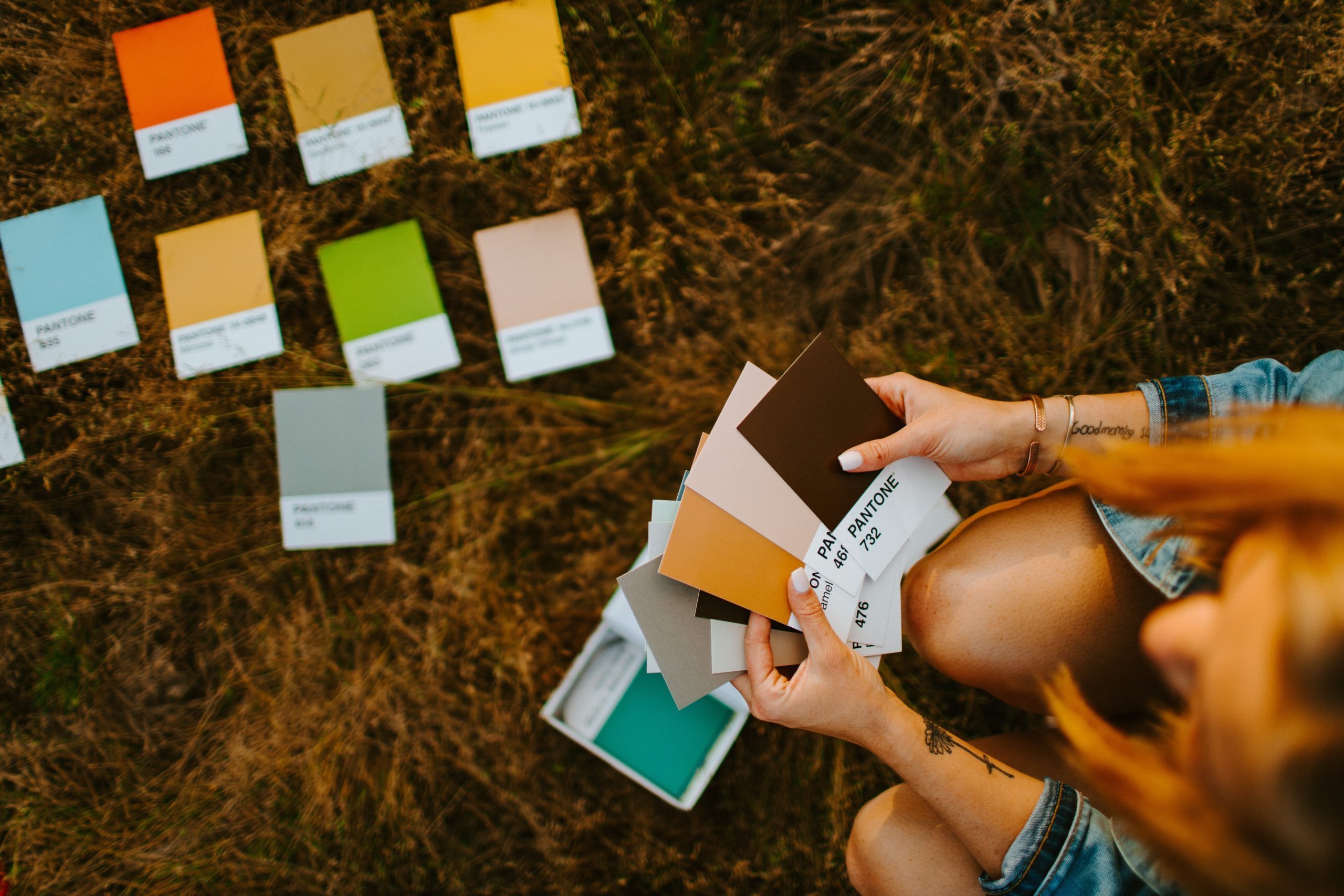
Color theory makes it easy to find colors that work well together or contrast in a pleasant way, and it’s an essential tool to use while redecorating your home. To get started, you’ll want to look at a color wheel to see where each color sits on the spectrum. A classic color wheel has 12 colors broken down into Primary, Secondary, and Tertiary.
A basic color wheel also has four segments descending inwards which show the different shades and tints of each color. Some color wheels have numerous segments that feature many niche colors as well. First, let’s keep it simple and focus entirely on the outer ring of the wheel which shows the three groups of hues:
Primary Colors
These are the most basic hues:
• Red
• Yellow
• Blue
Secondary
These are made by mixing primary colors together:
• Purple
• Green
• Orange
Tertiary
These are made by mixing primary and secondary colors together:
• Yellow-Green (Chartreuse)
• Blue-Purple (Periwinkle)
• Yellow-Orange (Amber)
• And more!
If you’re wondering where white, grey, and black fit on the wheel, they’re actually missing since they’re considered neutral colors when it comes to theory. Even without their place on the wheel, these three colors are essential in interior design either as the dominant colors or as thoughtful accents.
After understanding the outer hues, you can look at the next inner segment of the wheel which features tints. These are hues with a bit of white added.
The next inner segment features tones which have a bit of grey added.
Finally, closest to the center, you have shades which contain a bit of black to darken the color.
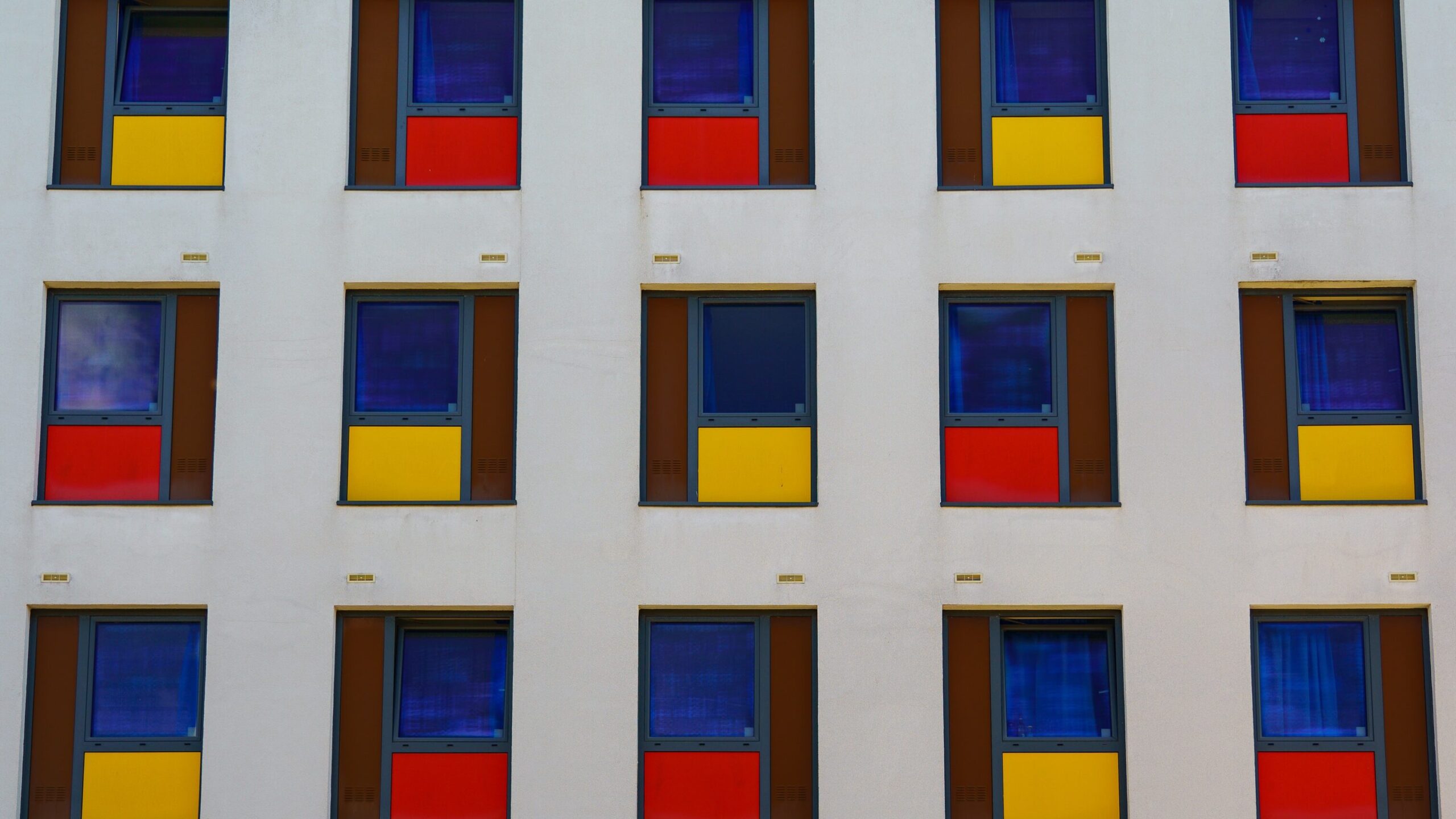
Complementary Colors
One of the simplest keys to home decor is using complementary colors to accentuate your space. On the color wheel, complementary colors sit directly across from one another. This means that red directly complements green, orange complements blue, and so on. Now, it’s not a hard and fast rule that you have to use complementary colors together; in fact, you likely won’t be decorating your entire home in orange and blue, but it’s helpful to have the complementary colors on hand so you can quickly reference these classic combinations.
Warm and Cool Colors
Each color has its own vibe, but there are two main groups when it comes to theory: warm colors and cool colors. Warm colors are often considered intense, passionate, or even energetic. These are red, yellow and orange. Cool colors, such as blue, green, and purple, are thought of as calm, relaxing, and tranquil.
The Emotional Effects of Colors, and Where to Use Them
While everyone has their own preferences, there are many common emotions tied to colors which can change how your rooms and designs are perceived. Here, we’ll go over the most common emotions tied to popular colors along with recommendations on which rooms they would work well in as the dominant color.
White
White is often thought of as pure, clean, spacious, and generally neutral. You can’t go wrong with white as your dominant color, and it lends itself beautifully to other colors when choosing accents. White walls with striking red or black accents are a bold favorite, while light-blue or gray accents can create a very open and calming space. Whether your office, bedroom, living room, or bathroom, white is a solid choice with many shades to choose from to make it your own!
Black
Black is a stronger neutral color that you likely won’t choose as the dominant color in your home, but it can be great as an accent against white, red, and many other classics.
Gray
Gray is as neutral as it gets and similar to black, it may be a bit too dark as your dominant color in a room. However, it may just be neutral and practical enough to work in an office depending on the shade used.
Red
Red is exciting, powerful, romantic, intense, and very warming as a dominant color. Red can spice up your bedroom, bring energy to your workout room, and can work as a great accent in the kitchen or restroom.
Orange
Orange is upbeat, positive, warm, and invigorating. It’s great for the kitchen, office, or living room as it contains many positive traits without being too overbearing like red.
Yellow
Yellow attracts attention in a positive way, and depending on the shade, it can either be very intense or more relaxing and cheerful. It can be a great color for a workout room, kitchen, or even living room if subdued a bit. If you want positive and active energy in your room, you can’t go wrong with yellow!
Green
Green is a stimulating color that shows life, positivity, and growth. This can be especially pleasant in an office since it’s an energizing color that’s also a bit less distracting than something like yellow.
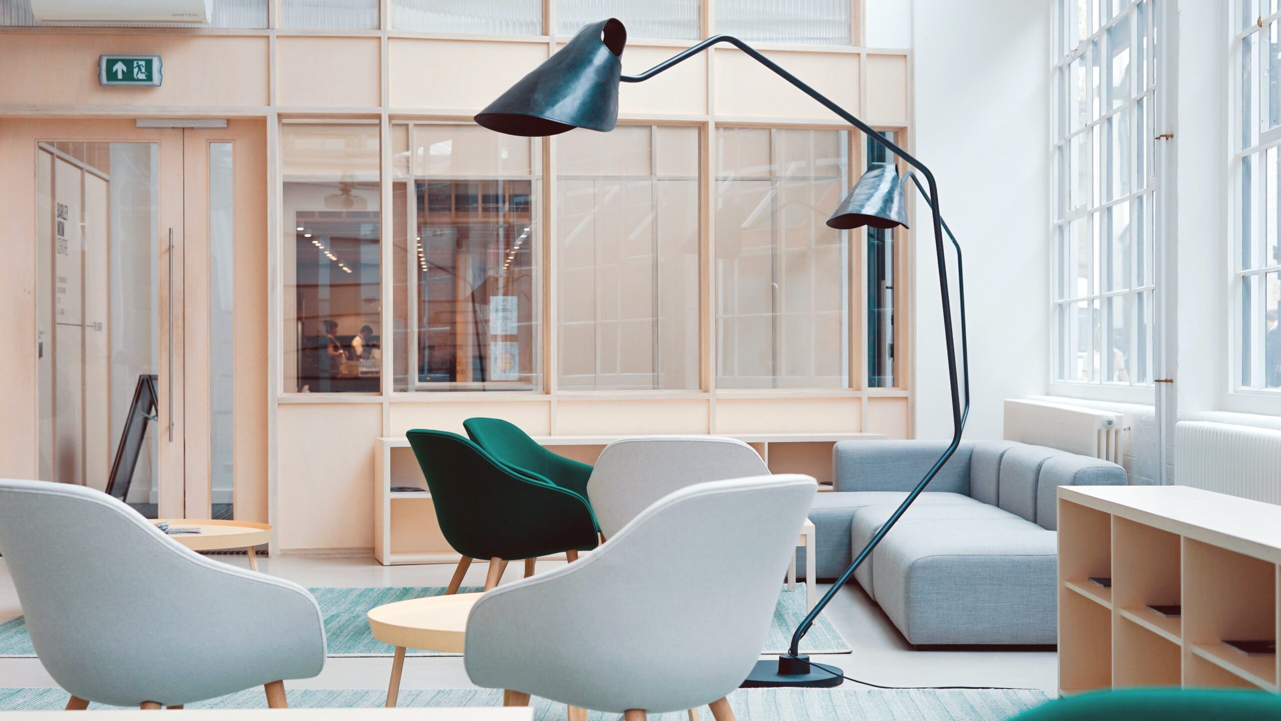
Blue
Blue is calming, pleasant, and also a bit cold which can be a great addition to nearly any room where you want to feel at ease. Bedrooms, bathrooms, and living rooms can all be enhanced with blue shades, although it may be a bit too calming for offices or exercise rooms for some people.
Purple
Purple is a classy and welcoming color that’s very peaceful to be around. Any room where you wish to read or feel creative can be enhanced with purple, and it even works as a great shade in the kitchen due to its floral beauty.
Color Schemes to Try in Your Home
There are many exciting color schemes to base your decor on, and you can use multiple schemes throughout your home or utilize similar ones for a cohesive presentation. Some combinations are bolder than others, but you can play around with different styles and shades to see what speaks to you.
Neutral Schemes
Neutral color schemes are great for when you want a beautiful room that doesn’t draw too much attention to itself. These schemes allow you to enjoy the decor without being consumed or distracted by it, and it’s no wonder neutral colors remain very popular around the world.
Some examples include:
Blue+Gray+Cream
White+Clay+Brass
Light Blue+White+Gray
All of these neutral schemes can create a calming atmosphere while still expressing your creativity and artistry. Plus, you really can’t go wrong with any combination, so you have a lot of room to decide which hues you’d like to be dominant on the walls and flooring and then really get creative with the accents.
Jewel-Tone Schemes
Jewel tones are based on gems such as ruby red, emerald green, and sapphire blue among many others. These tones are very saturated, deliciously bold, and elegant in a variety of settings. Amethyst purple can turn any room into a decadent space, and emerald green could be an exciting way to glam-up your bedroom. Jewel tones are great as both the dominant color or as striking accents. You can utilize pillows, blankets, and other decorations featuring these tones throughout your home for a bold and sophisticated statement!
Analogous Schemes
Analogous color schemes utilize colors that are directly next to each other on the color wheel to create a pleasing and comforting palette. These are color combinations and patterns that are often found in nature, such as green, yellow, and orange on leaves. You can allow the colors to coexist smoothly or really make them pop by going for a higher contrast by using various shades and tints.
Analogous combinations are often extremely pleasant since they combine warm and cool colors naturally together for a soothing aesthetic, and they contrast so well with one another that you can simply follow the wheel and find something you’ll instantly love!
Monochromatic Schemes
Monochromatic color schemes are a bold design choice where you stick to one color hue and utilize different shades and tints to really make the room unique. As an example, a monochromatic room could be entirely green with darker and lighter green accents throughout. Or it could be yellow, red, or anything else you desire so long as you stick with one hue. This is a rather artsy design choice, but it may be just what you need in a creative space!

Your Rooms, Your Colors, and Your Mood
By understanding the fundamentals of color theory, you can now use them to create a living space that truly speaks to you. Sometimes a room calls for white walls with black accents, and other times a room calls for light-blue walls and popping yellow sofas. Think creatively about which colors and combinations you’d like to surround yourself with, and also think practically about the purpose of each room.
Think about what you’ll be doing in each room and allow this to guide your color choices so you never feel out of place. You may want one room to be more subdued and less distracting, while another room’s colors may be chosen strictly for beauty and creativity. As you brainstorm, remember that different lighting can also affect the overall tone of the room. Natural sunlight will affect colors differently than certain lamps, and your lighting may change drastically throughout the day, so make sure to play around with different scenarios before settling on a scheme.
Most importantly: enjoy your new home decor! The more you utilize color theory, the more natural it becomes, and pretty soon you’ll be picking out the perfect decorations and accents that bring your space to life. By studying the beauty of color theory and interior design, you’ll be able to truly express yourself and create the home of your dreams!